
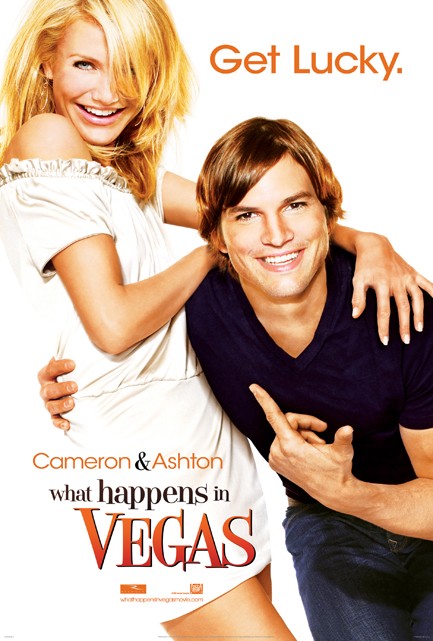
immediately something bothered me about the TV and internet ads for this movie, but i couldn't put my finger on it. it was driving me crazy. then i realized it. it was the FONT. this isn't something i like to advertise to my friends, but i am a huge font nerd. i think the right font can make or break your poster/flyer/ad etc. sometimes i will spend hours downloading fonts onto my computer. it's weird, i know.
anyway, does the font look familiar?!
it should because they totally jacked it from taco bell. it's the font they've been using for years!

that is one serious font fuck-up.

5 comments:
That font is horrible. Just plain horrible.
If you haven't seen this already... this post made me think of this clip... http://www.youtube.com/watch?v=t87QKdOJNv8
Oh holy crap, you're absolutely right. Ugh.
Very close but different. look at the lower case "a" on the vegas poster it curves up at the bottom, on the taco bell poster its straight and the letter is more condensed.
:)
You're crackin' me up!
Post a Comment